
Follow the way people enter
Look from the open doorway and then from a few steps inside. The wall seen first may differ from the wall visible beside the console. A narrow passage encourages a quick, angled glance, while a wider entrance allows someone to pause. Place the main visual interest where it can be enjoyed without standing in the route of the door. Test the complete frame outline and allow for the door swing before settling its position.
Let the console and frame speak together
If there is a console, consider the artwork and the furniture as one grouping. Aligning the frame with the console often feels more settled than centring it on the entire wall. Then look at the lamp, bowl and other objects below. For example, a strongly patterned frame above a patterned runner may benefit from removing one smaller ornament. The aim is a clear hierarchy, not a rule that every object must match.
Choose how much the entrance should say
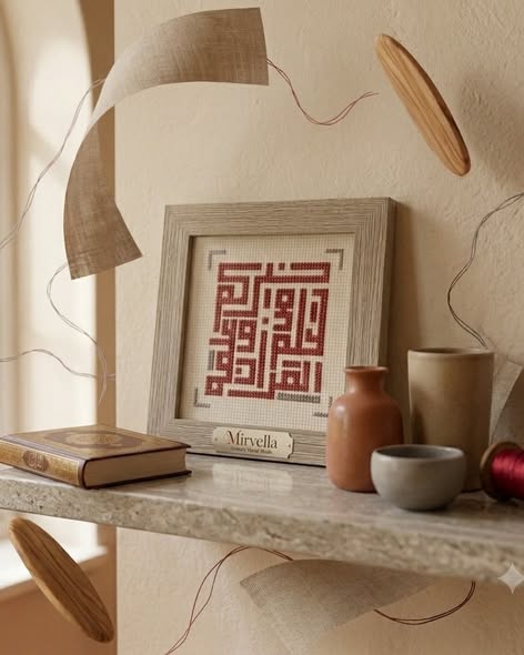
Lettering introduces words into the first view of the home. A compact composition may be appreciated as a shape before its text is read; a longer phrase asks for a closer encounter. Floral or geometric embroidery lets pattern lead without that reading task. Decide whether you want a greeting, a quiet decorative rhythm or a piece people will ask about. If choosing words, establish the exact text and whether it suits the household.
Keep everyday use in the picture
Keys, bags and post tend to gather near the door. Leave room for those habits instead of designing a corner that works only when everything is removed. Check the view by day and under the entrance light; glare can hide detail in a glazed frame. Keep the artwork clear of frequent contact and use hanging arrangements suited to the actual piece. A welcoming entrance is one where the artwork remains easy to enjoy on an ordinary day.