
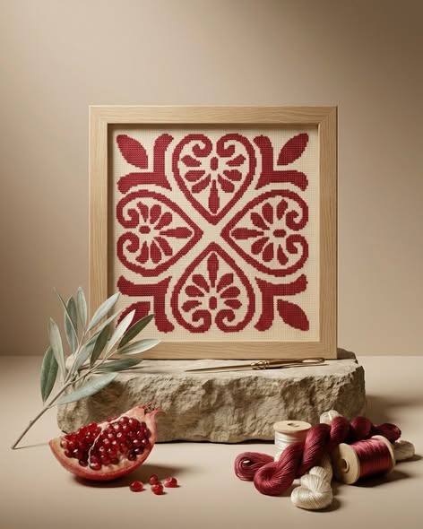
A composition is more than a collection of stitches
A densely filled surface is not automatically a stronger design. Notice where the eye begins, how it moves between shapes and where it can rest. A restrained composition may depend on carefully judged gaps, while an intricate one needs a clear relationship between its parts. Imagine removing a border or changing the centre: does the balance change? This small exercise helps you recognise design choices that are easy to overlook when comparing only the amount of embroidery.
Thread changes the experience of an image
Viewed from across a room, embroidery reads as colour and shape. Closer to it, the direction of the stitches and the relationship between thread and ground become part of the image. That change in viewing distance is one reason someone may choose a textile artwork rather than a flat reproduction. It does not mean every embroidered object has the same finish; the material and execution of the particular piece still deserve an accurate description.
The frame belongs to the work
A broad frame can make a modest embroidered area feel substantial; a quieter edge can let the pattern lead. Consider the ground colour, the visible margin and the frame together. A piece that seems expensive beside an unframed textile may include a different presentation altogether. Compare the complete object you would display, rather than treating its frame as an incidental extra.
Personal value need not become a grand story
You might be drawn to a colour that recalls a family room, or to lettering whose meaning you want to live with. That is enough. A personal association does not need to become an unsupported claim about a motif’s origin. Choose the work you expect to enjoy repeatedly, then weigh its confirmed contents against a comfortable budget. Neither the largest piece nor the most elaborate one is automatically the most meaningful.