
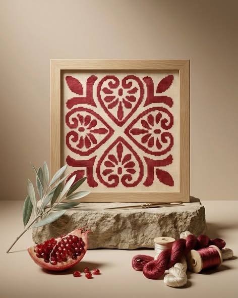
Read the whole rectangle first
Look at the outer frame, the margin inside it and the embroidered area as one arrangement. Does the design occupy the centre, lean deliberately to one side or repeat around a border? Cropping can remove the very space that explains a composition. A vase or folded textile in the foreground may hide an edge. Begin with a complete front view before deciding whether the arrangement feels balanced; the most attractive close-up is not necessarily the most informative image.
Then follow one small detail
Pick a place where two shapes meet or a colour changes. A closer view lets you notice the thread surface and the outline of that particular passage. Check that the detail belongs to the same example as the full photograph; otherwise you may be comparing different versions. The image helps you see execution, but it cannot establish materials, handwork or the unseen back of the frame on its own.
Separate perspective from size
A frame photographed close to the camera can appear larger than furniture farther behind it. Even a familiar chair is an unreliable ruler. Use the stated outer width and height to make a paper outline for your wall. For two works photographed differently, compare their outlines side by side. This often changes a first impression: the quieter image may show the larger object, while a dramatic close-up may show a small piece.
Compare colour relationships, not screen swatches
Notice whether a red stands out against a pale ground, or whether the frame is darker than the stitching. Those relationships can be useful even when a screen shifts the exact hues. If a precise match with an existing textile is essential, explain that need rather than relying on a screenshot. Finally, establish whether the photographs show the offered piece or a design example. That one distinction prevents a good visual reading from becoming a mistaken expectation.